





Identity for the Qommett Brand
Working on “Qommett” became a defining moment in my growth. I evolved from an executor into someone who shapes vision. With no finished products and no established content, I brought in contributors only after I had formed a clear vision within a space of uncertainty: identity, design system, presentations, website, social media.
The result wasn’t just an identity — it was a full-fledged design foundation that continues to live and scale without my involvement. That became my main achievement.
Project lifetime: 4 Dec 2024 to 4 Feb 2026
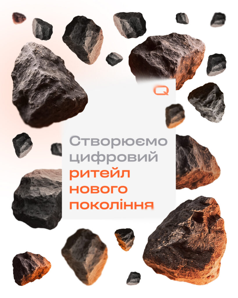
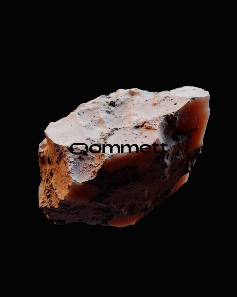
The Devlight team needed to solve a strategic challenge — to create a brand that owns the full chain of products and services for digitizing the modern retailer. This would leave the core Devlight brand to focus exclusively on mobile applications. The new brand got the name Qommett — echoing “comet,” a bright object on a precise path that always reaches its target.
The brand’s main advantage is the strong expertise the Devlight team built by developing more than 120 projects over ten years.
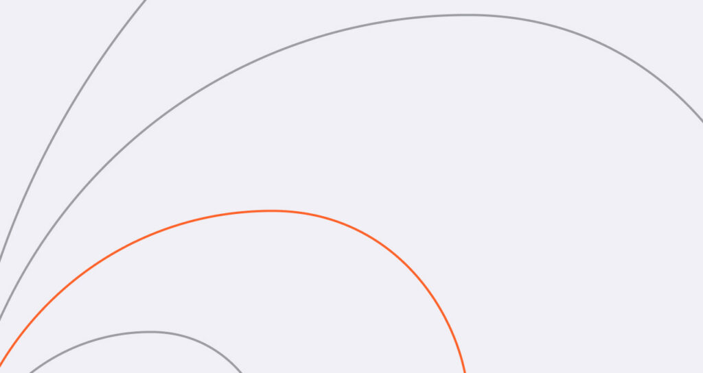
A comet’s trajectory is metaphorically reflected in the identity through the golden ratio spiral. It symbolizes Qommett’s perfectly curated set of services, which includes the full chain of products and services for digitizing the modern retailer.
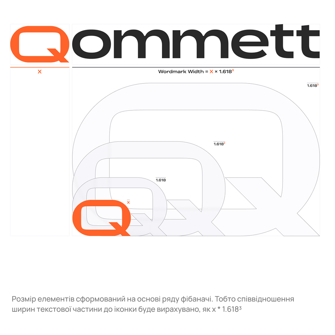
The icon is based on the basic letter Q from the Marevo Medium typeface. The letterform is extended to fit a golden rectangle, whose sides form the golden ratio. The letter’s tail received an altered tilt angle and now occupies a significant area within one of the inner rectangles of the golden ratio.
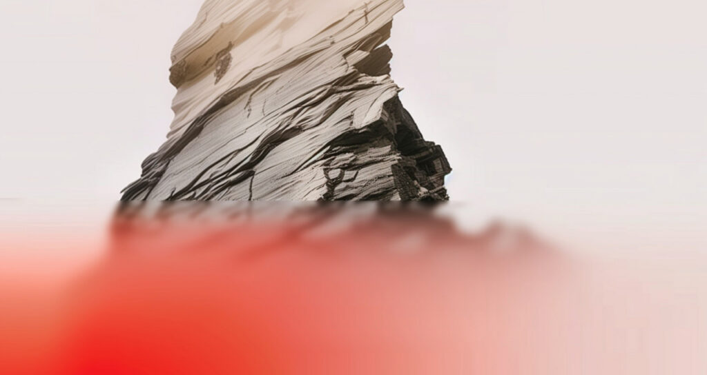
Visual principles drawn from the nature close to us flowed into the identity and took a foundational place within it. All of this serves to build a strong, scalable visual base that reinforces the Qommett brand:
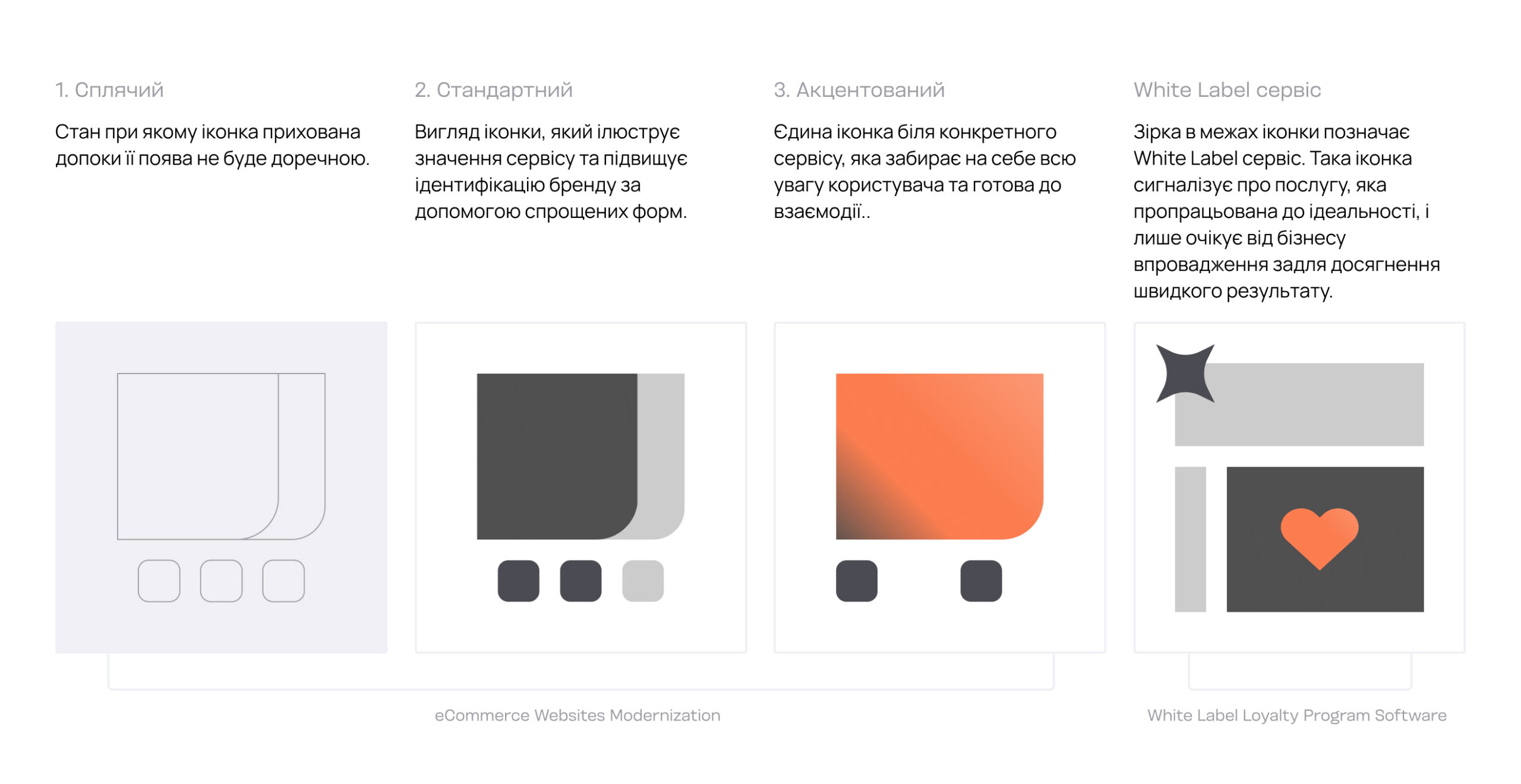
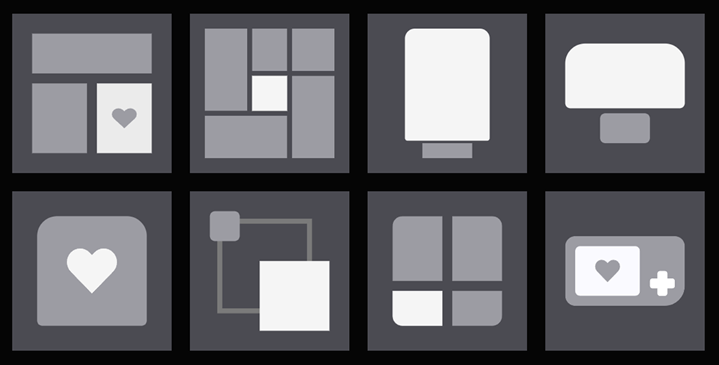
Accent in the icons appears only at the right moment — during interaction. When an icon first appears, its elements show up simultaneously and quickly. In the transition from the default state to the accent state, the elements transform and, most importantly, orange appears, drawing the user’s attention. You can test the icons’ interactivity via the link.
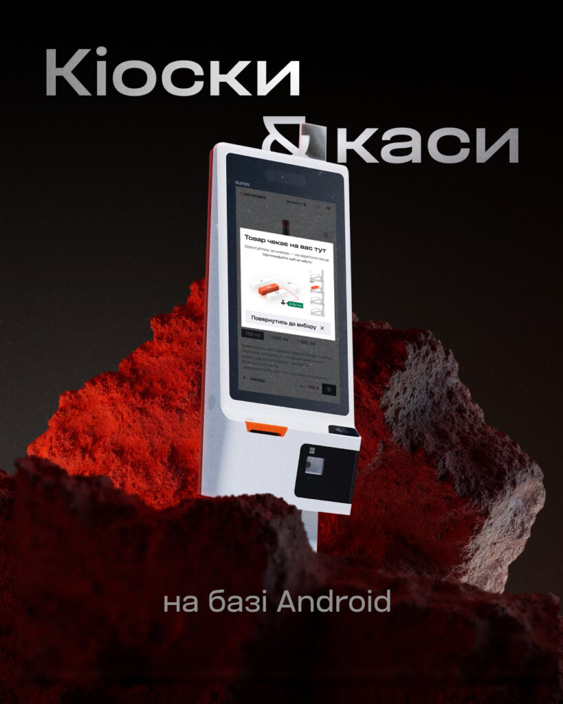
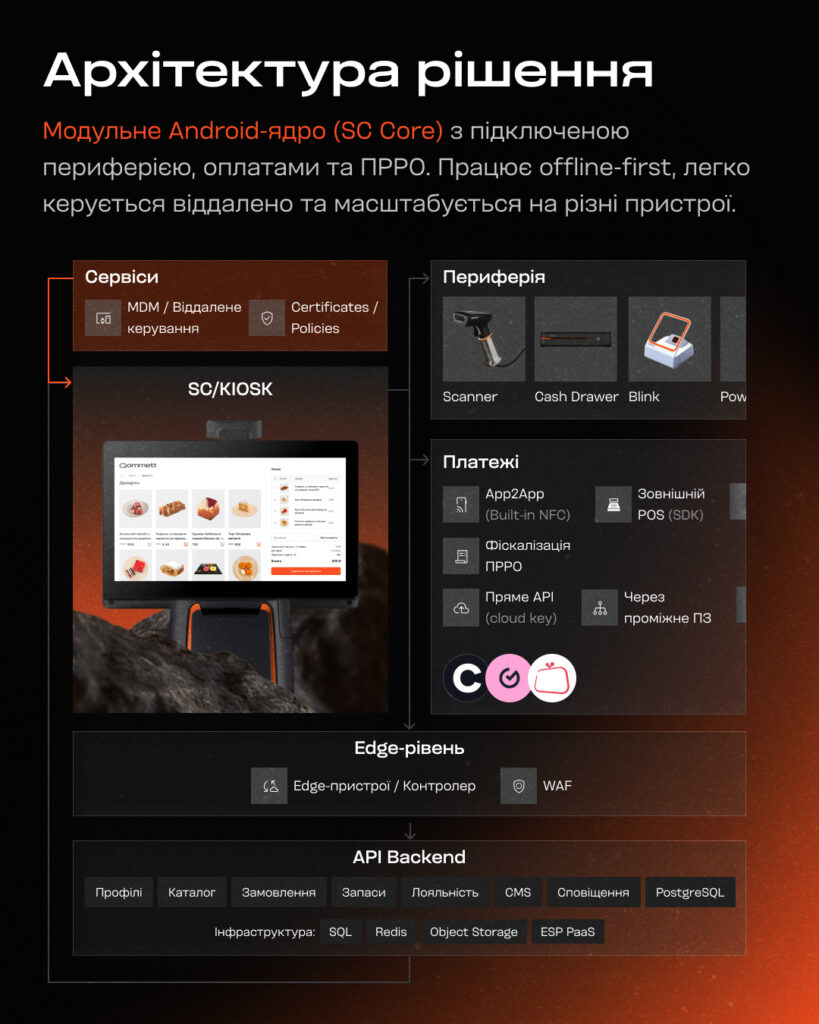
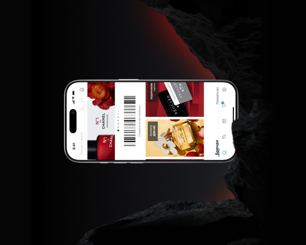
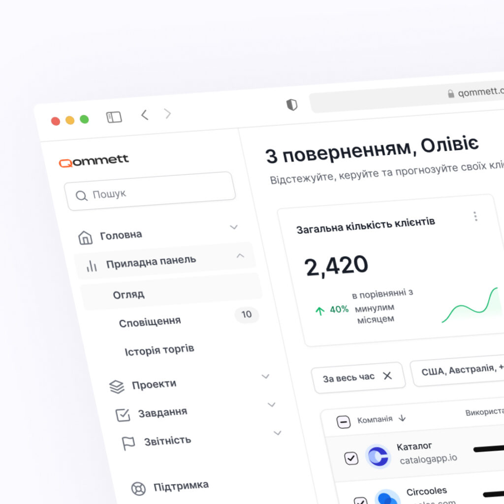
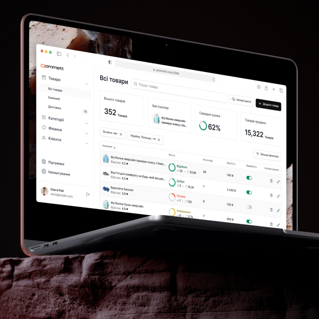
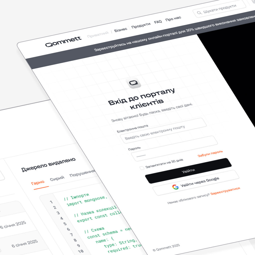
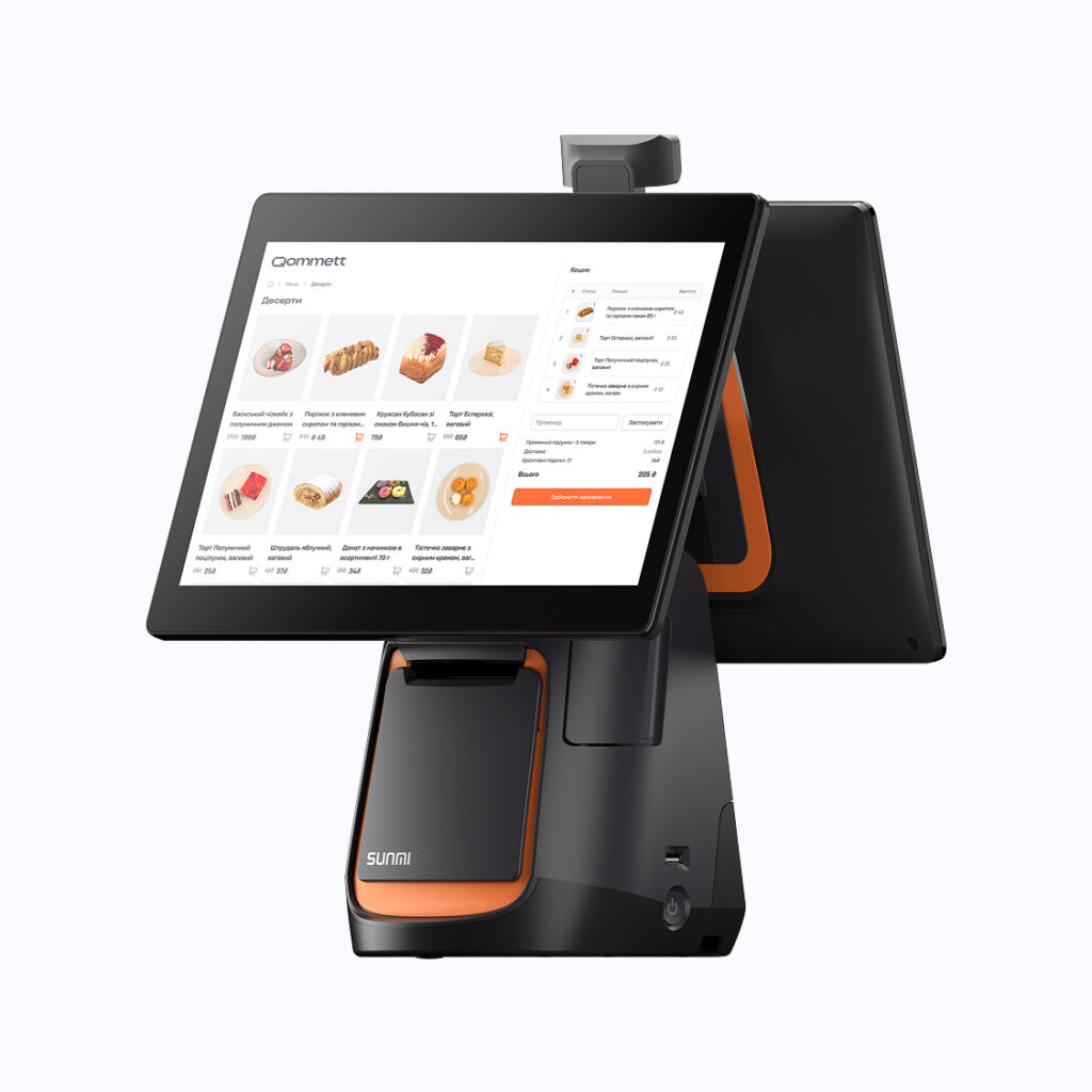
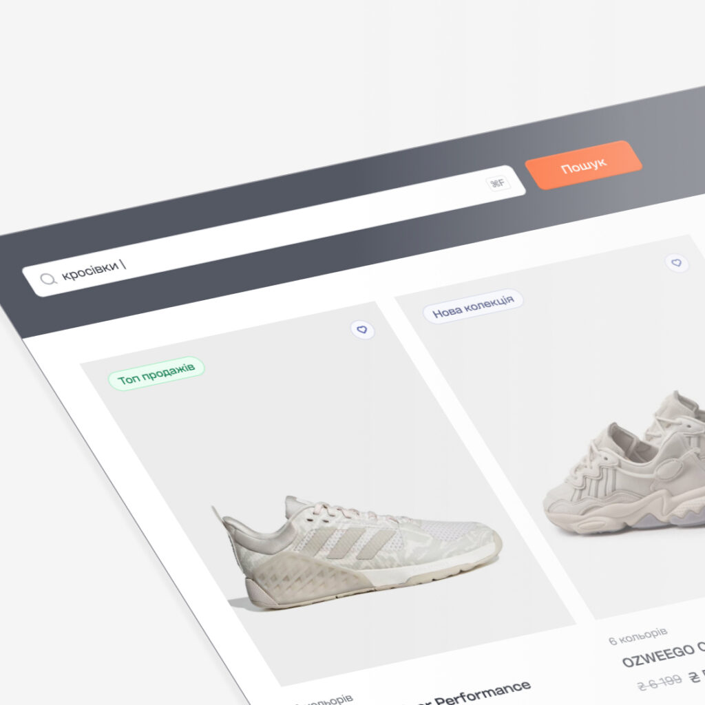
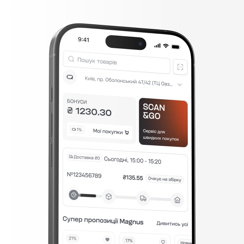
The interfaces are built on a customized Untitled UI Kit. This approach helps shape new flows. The method was easily applied to display interfaces for web platforms, mobile apps, as well as self-service checkouts.
Denys immersed himself deeply in the project — he ran the brief and additional meetings, with the goal of building a strong brand. The result was an identity with its own character that set Qommett apart visually. He led the project from the first creative idea through to the creation of public releases, continuously scaling the brand image.

The development of Qommett's identity took place in parallel with the team's other projects and tasks. Despite this, Denys took on a strong role in the process: he took responsibility for visual decisions, kept timelines on track, and maintained the integrity of the direction across all stages of the work.

The most valuable thing, in my opinion, is that he managed to build not just a set of separate artifacts, but a systemic identity. The logo, color palette, typography, composition principles, and templates work as a single ecosystem rather than as a collection of independent elements. Thanks to this, the brand gained a clear structure that's easy to scale and use in future work.
But what exactly made the identity systemic? I'd point to the presence of clear principles that unite all the components of the visual language. Every decision was part of the brand's overall logic, not a standalone design find.
As for Denys's approach to responsibility, I'd describe it as proactive. He didn't wait for external management or additional instructions — he moved the process forward on his own within the defined concept, made decisions within his area of responsibility, and ensured tasks were completed on the agreed timelines.
Bohdan Khomiak - Marketing Manager at Devlight
Coming soon
Denys immersed himself deeply in the project — he ran the brief and additional meetings, with the goal of building a strong brand. The result was an identity with its own character that set Qommett apart visually. He led the project from the first creative idea through to the creation of public releases, continuously scaling the brand image.
Devlight Team
CEO / Ihor Polych
Marketing Lead / Hennadii Akimov
Art Direction / Roman Khomiak
Marketing Manager / Bohdan Khomiak
Creative Designer / Denys Shendryk
and action
Graphic designers / Denys Shendryk, Yelyzaveta Sakaliuk
Motion / Denys Shendryk
UI/UX designers / Denys Shendryk, Liliia Borovyk
Web-developers / Andriy Holovkov, web-studio Brainlab
3D-generalist / Denys Shendryk
AI-creators / Denys Shendryk, Yelyzaveta Sakaliuk